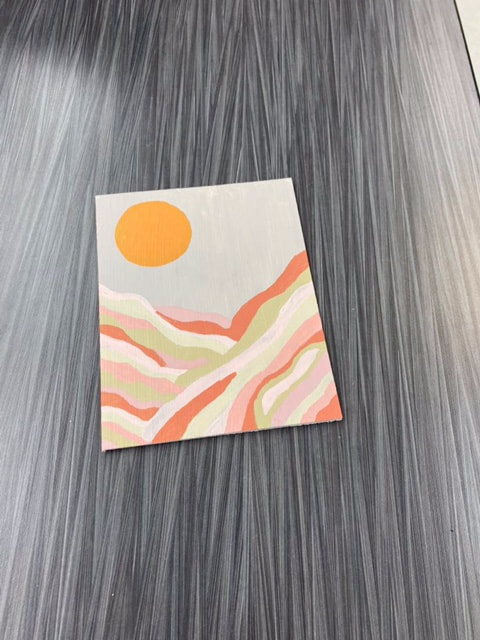
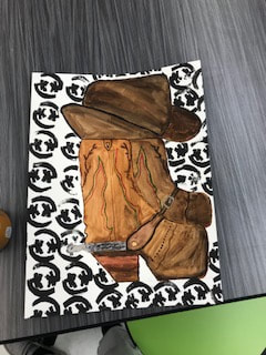
 My best or favorite artwork was this one below, i really like this one cause its simple and it came together really nicely. It was fun to sketch it out and making the colors how i exactly wanted was a challenge but it was fun. My one artwork that i would like to redo would be my boot artwork that had my own logo on it for the background. I would like to go back and maybe plan a little more and have some more time to work on it cause i was kinda rushed towards the end. The boots had good detail but id like to try and make them look more natural and maybe try a different material instead of water color my original plan was to use color pencil but that changed in the planning process. In this 2D art class i have really learned how to think outside of the box and how to learn from the mistakes that i've made, and even though i made a mistake i can take that and make it into something even better. Even though its three D i would have really liked to work with clay. Ive done it multiple times and its just so fun making bowls frames and figures. I remember when i was little so like 4th or 5th grade i took a class that you could take and make a frame out of clay and you were the teacher . It was such a fun class it was a two day class but it was so fun putting glaze on.
0 Comments
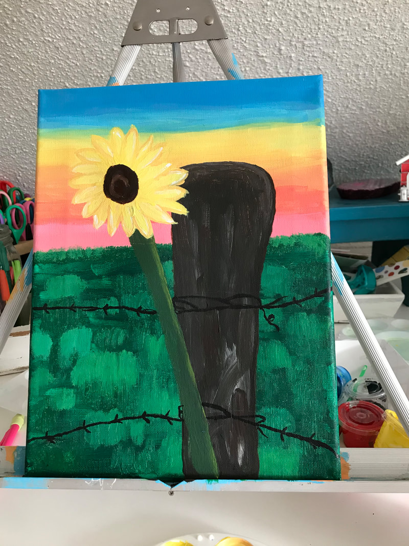
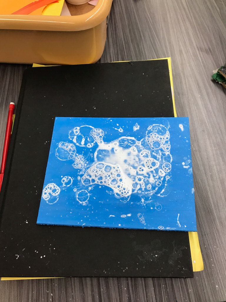
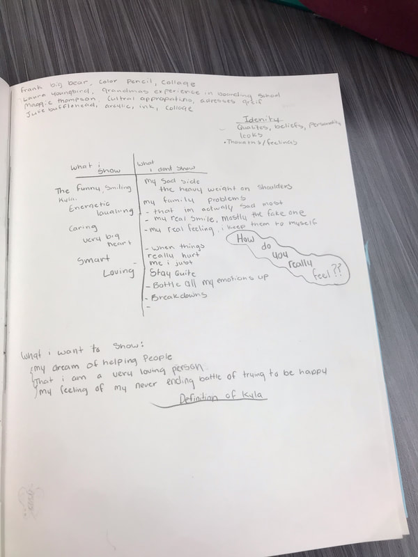
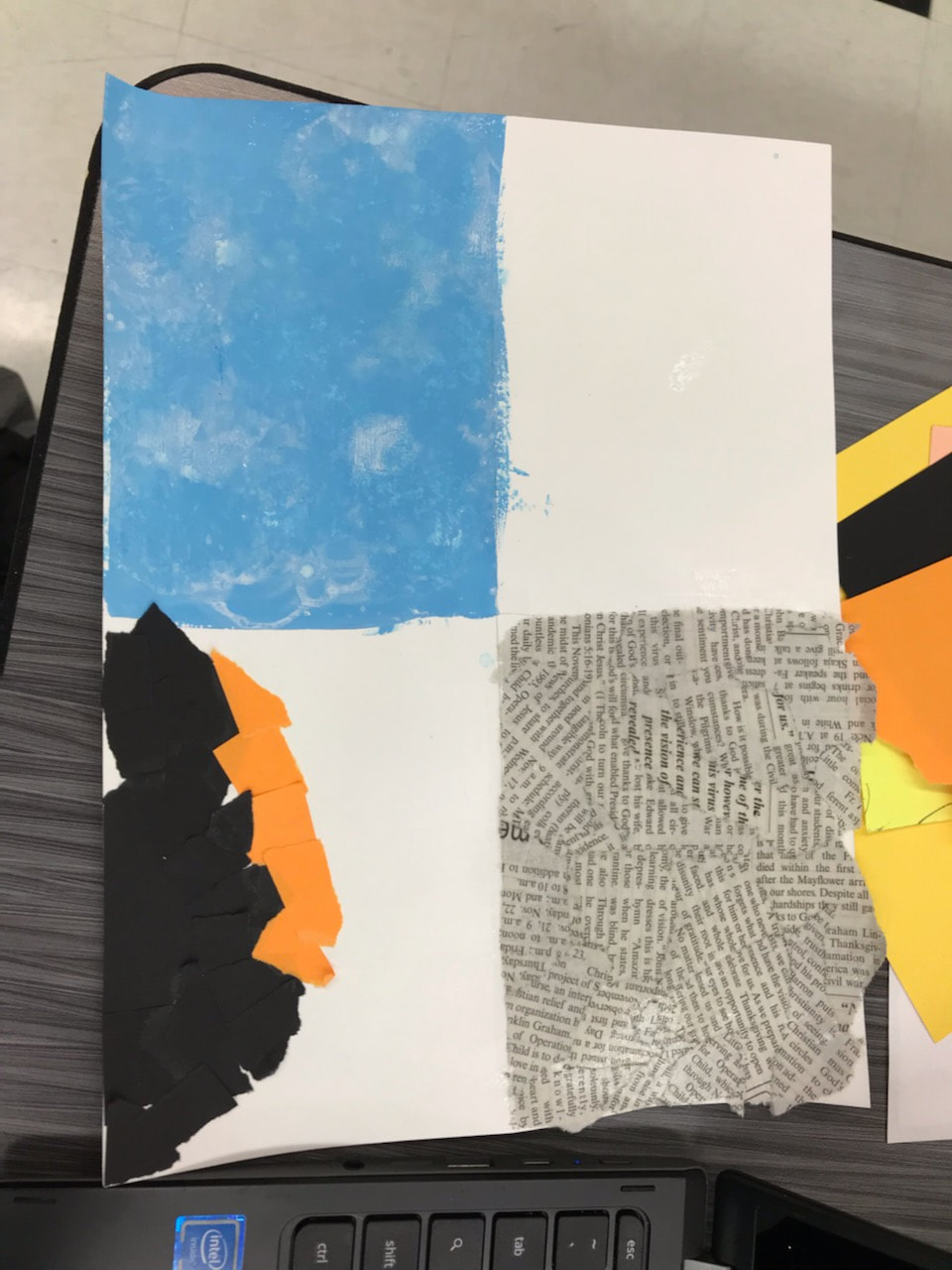
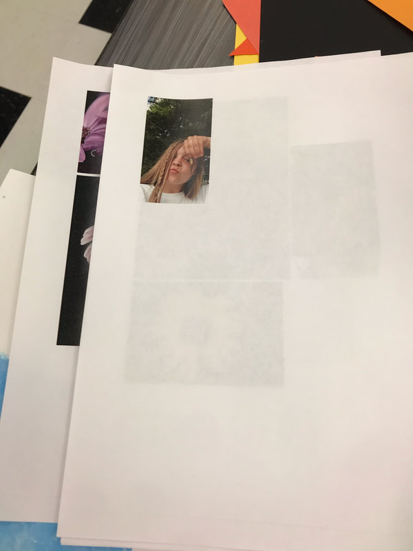
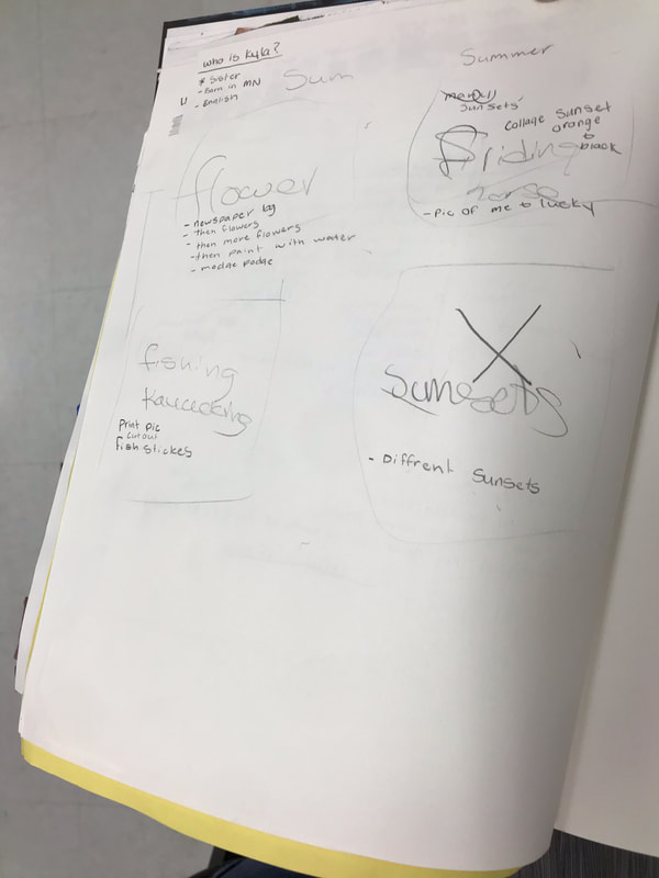
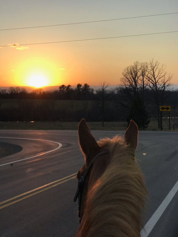
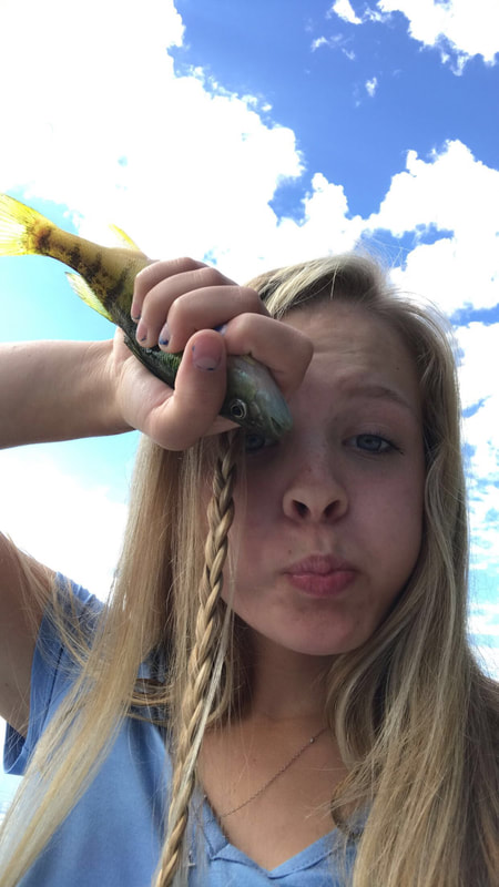
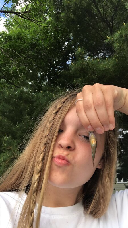
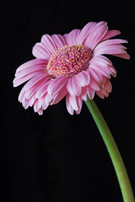
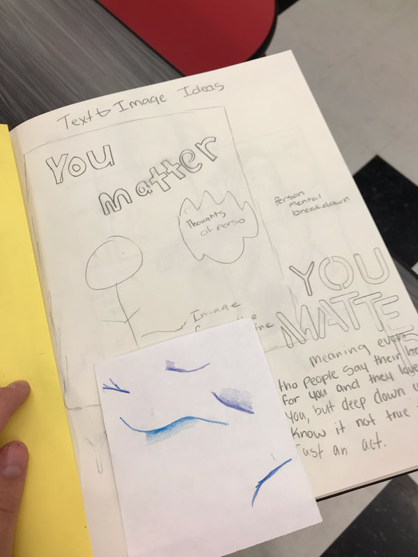
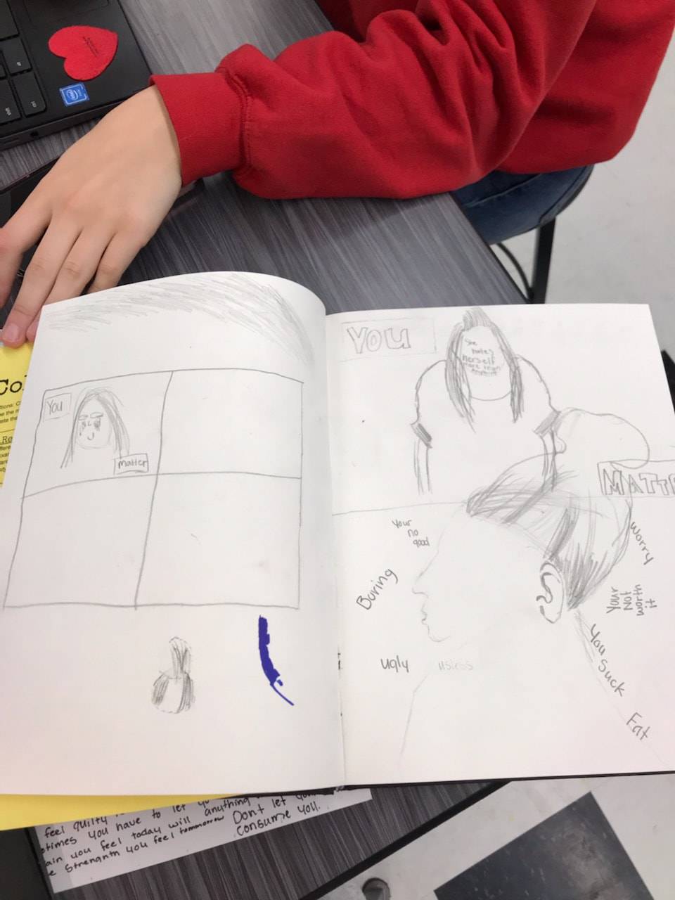
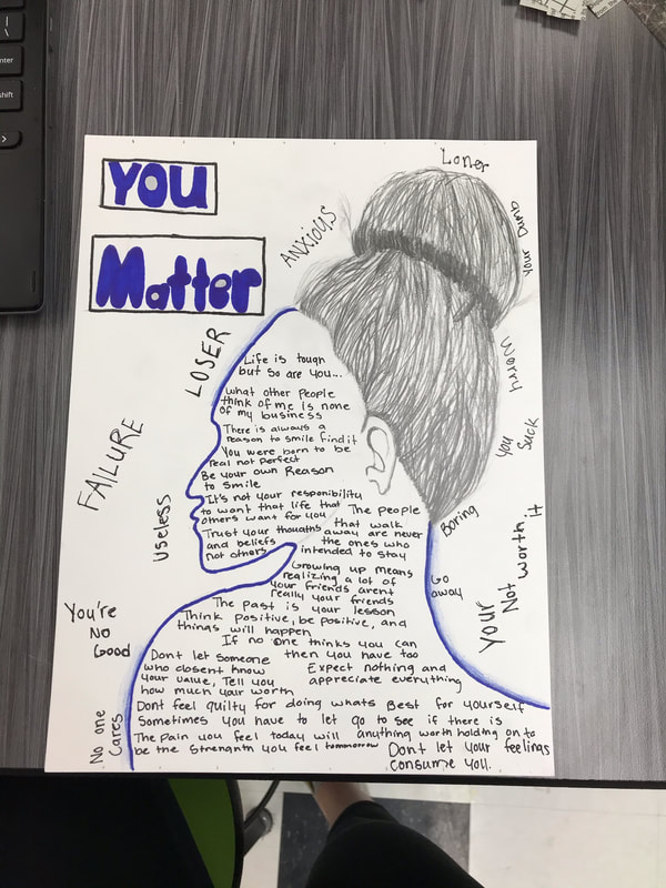
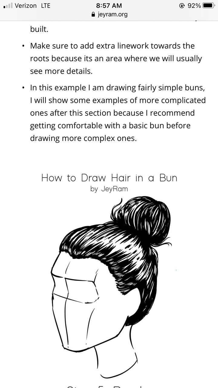
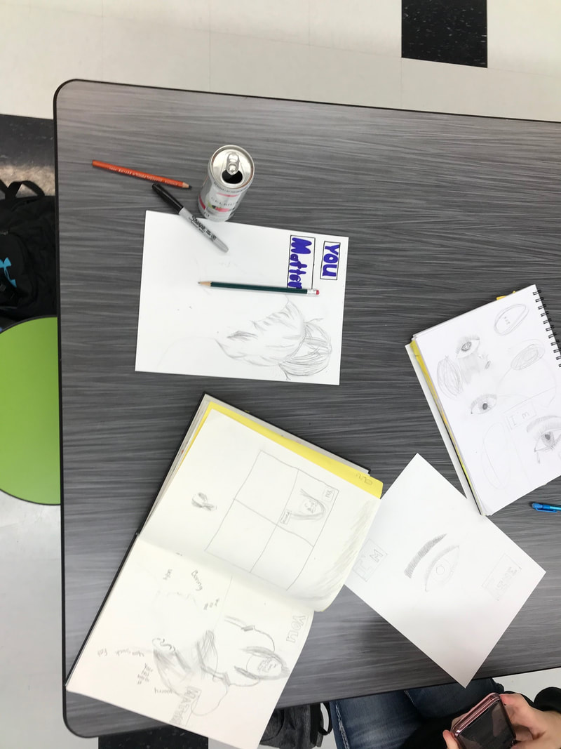
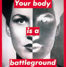
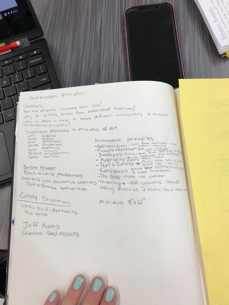
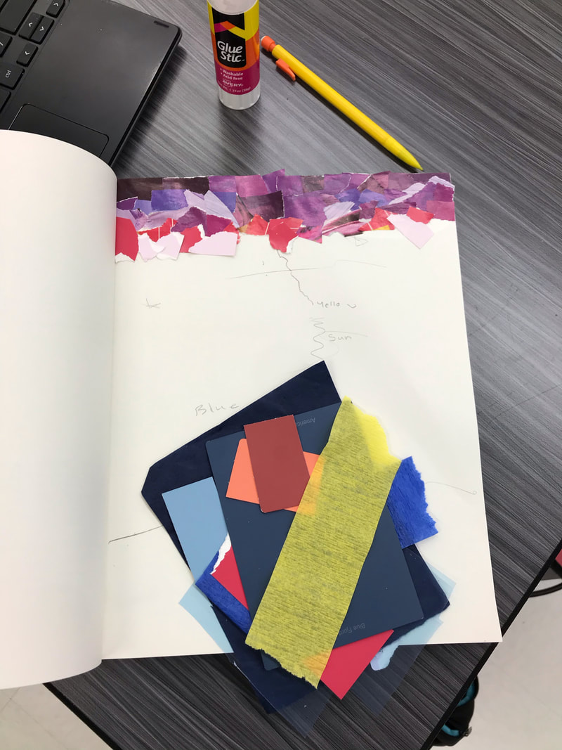
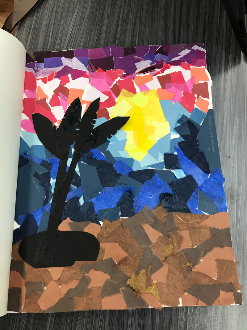
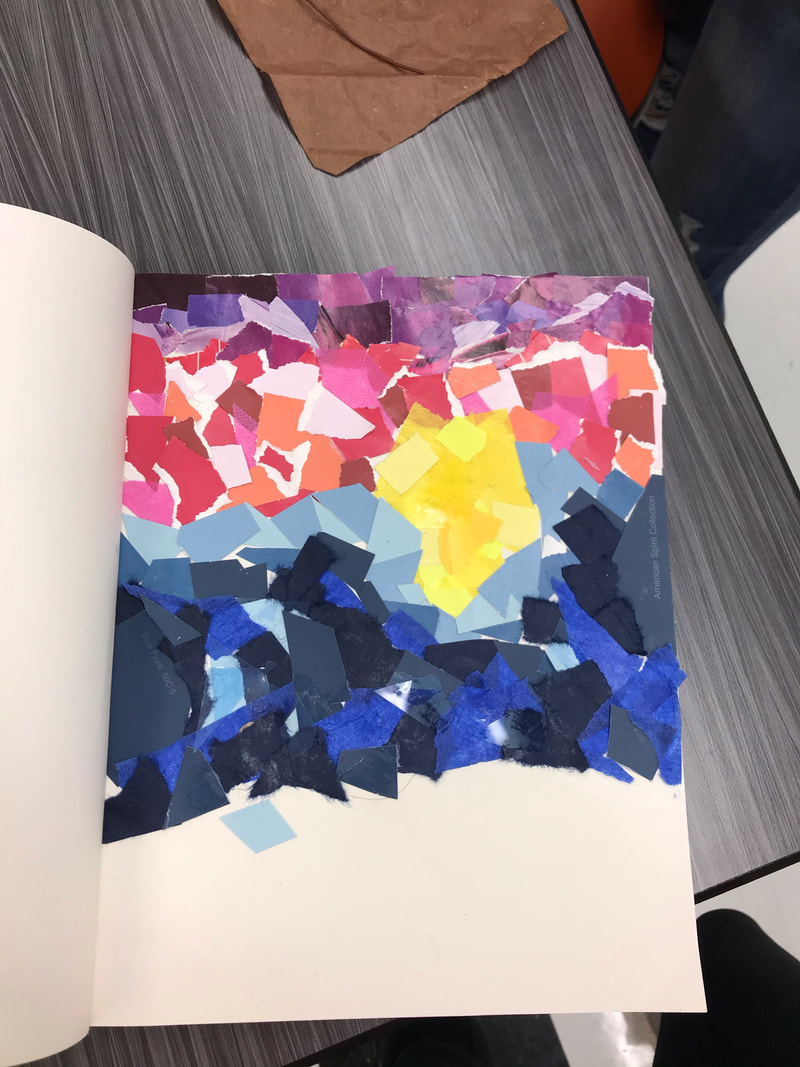
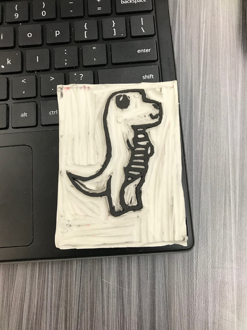
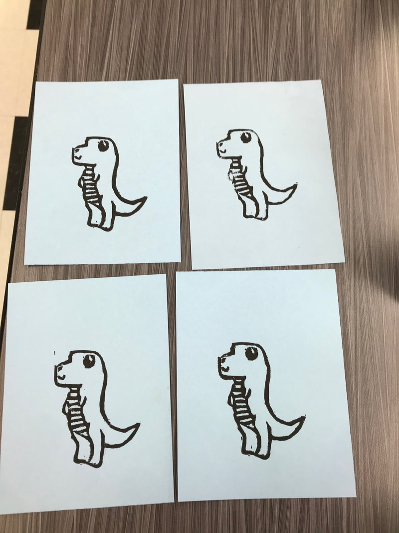
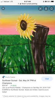
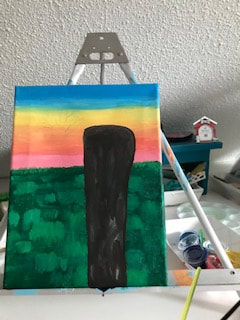
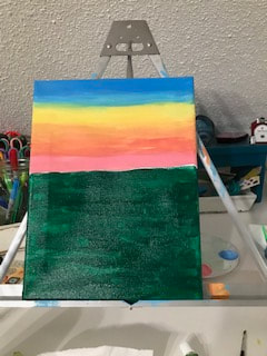
My artwork is a series of three, there's three masonite panels and they each have there of design, look and meaning. The first one has a blue background, has whats supposed to look like bubbles on top of the blue background. Then in each on of the four corners there is a fish and the fish is a sticker. Then in the middle of the peice there is a picture of a girl holding a fish. The second panel Has a newspaper background and it has been laid out and torn up to fit the panel. On top of the news paper going around the edges is tissue paper and the tissue paper has been scrunched up to make it have more detail. The 5 color of tissues paper are all an asort of green and there kinda in a pattern. Then in the middle of the tissue paper id picture of my flower and other flower. There aligned next to each other. It goes red, yellow, purple, orange red and purple flowers. The third artwork is a collaged background and the collage is a sunset one. It starts with back on the bottom then you have a bright orange then the oranges start to keep darker and darker. The top of the canvas has the darkest orange. In the middle of the sunset there's a sun collaged below that is a picture of a horse with sunset in front of it. All the three canvas are hotdog way and have been coated with modge podge. How i created theses three pieces of art was i took parts from my life and said how could i make that into art. For my first one i had to put a coat of primer on first then i painted it blue, and after that i took a little cup and put a lot of soap little water and white paint. After i had my mixture then i had a straw and blew into it to try and make bubbles for on top of the canvas. After everything dried i put the fish sticker on put a coat of modge podge on then put my picture of mt holding my fish. For the second art i really wanted to do newspaper for an artwork so i incorporated that into my background i tore up news paper and put modge podge over it and collaged that together. On top of that i grabbed multiple colors of green tissues paper and scrunched it to make the artwork have more detail, i used regular glue stick for the tissue paper. Above the tissue paper i put pictures of my own flowers and glued them down. For my third and final art piece it took a lot of processing, i looked up online for orange sunsets to really get to understand how to put the colors together. Once i figured it out i started with the black bottom and started putting it together. I found all of my oranges form magazines, tissues paper, and the scrap paper drawer. The sunset has a little layering into it i really tired to get it to look like a sunset. I used just a regular glue stick to glue the pieces of paper down. After it was down i took my picture of lucky my horse and in front of us was a orange sunset, And i finished it off with putting a coat of modge podge over the top pf the holle piece. The big idea behind my artwork was too find a way how i could take something from my life that's a big part of it and turn it into an atwork. In my three arworks i am expressing my love for fishing , flowers, sunsets, and riding horse. How i expressed this was trying to incorporate me in the artwork with that subject. Like the fish one i have a picture of me and the fish and the sunset one is a picture of me on my horse looking into the sunset. My goals for this artwork was to show what i love to do and what has shaped me into the person that i am today. All my life i have been around those four things and it has really made me into the person i am. All the time out fishing with family, Picking flowers with my grandma and riding horew with all my friends, even family. My overall thoughts of my artworks are that they really came together. I love how they all turned out but if i were to redo one id redo my flower one and try to make it look a little better. Next time i would maybe just paint a flower on top of a newspaper background. Other than that i am really happy with the outcome of my art. 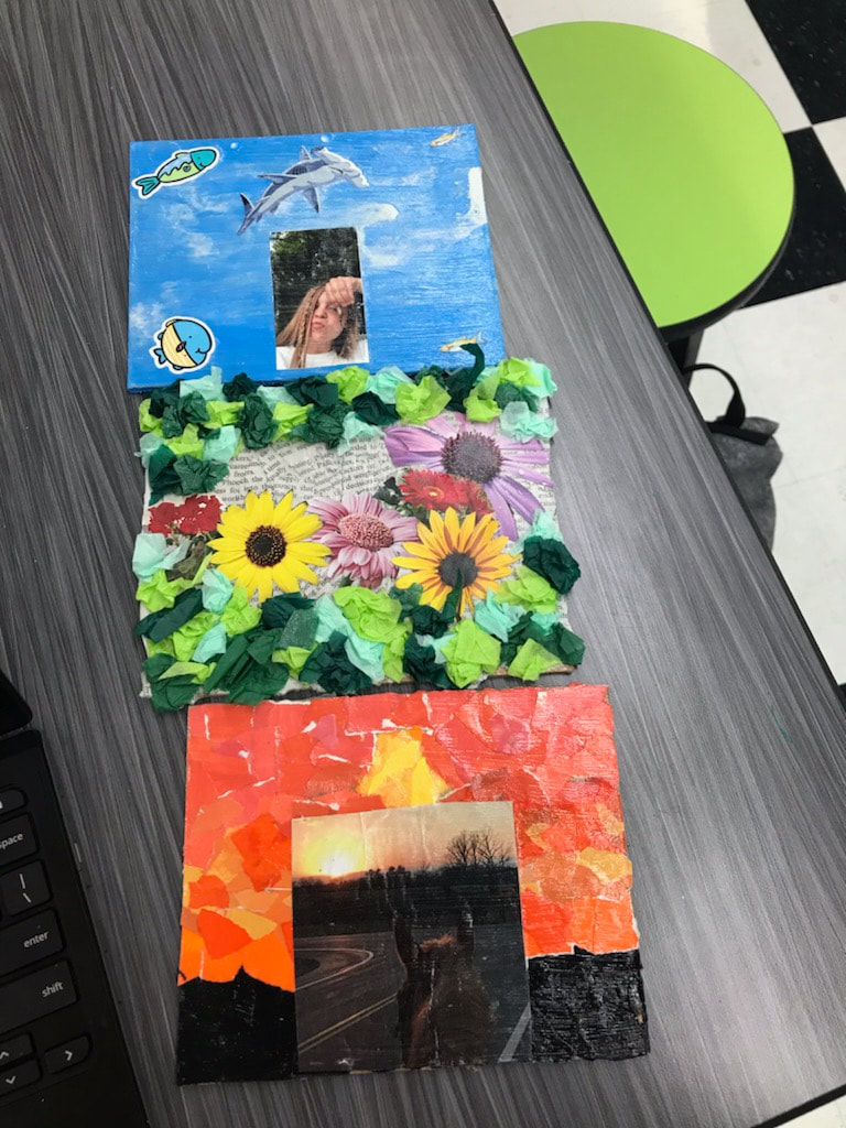 For the two studio habits i have been using develop and craft along with express. Develope and craft come in when im using many materials to complete my final artwork of three. I'm using newspaper, paint, exacto knife, tissue paper, pictures and etc. Express comes in when i'm creating theses artworks to express about myself and the things that are a part of my life. The three canvas consist of sunset, fishing and flowers. My plan has stayed the same throughout the whole process, and so far i am liking how the artworks are coming together. The flower canvas has been finished and the sunset collage is almost done. 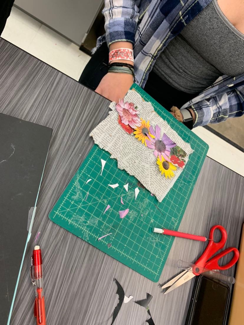 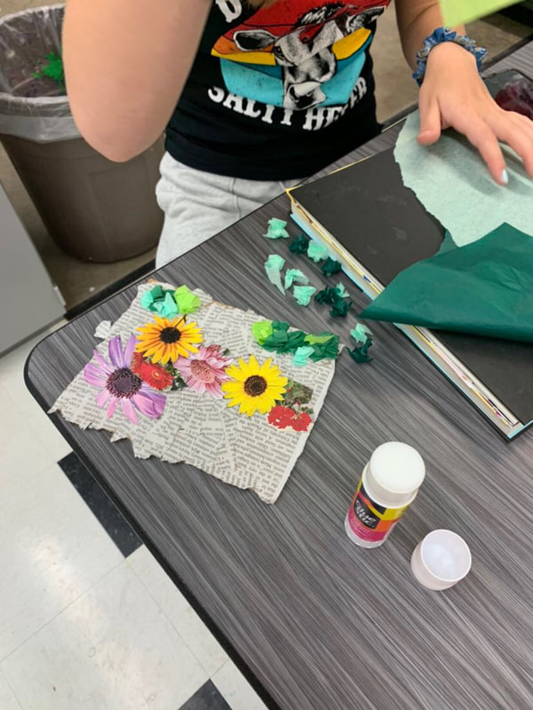 For my final artwork I am planning on doing three canvases that have things on them that contribute to my life. I am using develope and craft, since i'm using multiple tools and materials to form this artwork. So far im doing mixed media, using paper, paint, pictures and even stickers The other studio habits i used stretch and explore i am reaching beyond my capability and learning from my mistakes that i have made on my rough daft of an artwork. My artwork that i made is one that really puts a message out there. Its a side profile of a girl, just the outline with her ear and she has a bun. In the top left corner there in the words you matter, and around the girl there is words that people say on the daily to other people. They don't think what they say affects people but deep down it does. FIlled in the side profile fo the girl is words or phrases of encouragement and quotes that just keep you going in life. I created this artwork by searching up how to do side profiles and how to draw a bun. For the outline of the side profile i just used pencil to sketch it and went over it with blue sharpie. The bun was my biggest challenge i watch a tutorial that lead me to a website jeyram.org and it had a really good technique and diagram on how to do it. I first tried using charcoal pencil but it was way to dark then i went to seckting pencils and used many of these to get the air line to come together. For the worlds outside the side profile and the ones in side of it i used jus plain old sharpie. The big idea behind my artwork was to show that words can really affect someone and in the end it going to be you that going to have to pick yourself up over and over again. Your only gonna have yourself in the end and you have to have a strong mindset. My goals for this artwork was to uses text and image to really get a message across to them, in this artwork i am expressing that you should watch what your saying to someone and be nice cause you dont know whats going on in their life. The words you matter really help bring out the message, cause you see those but then you look over and see failure, useless, loser and etc. My overall thoughts on this artwork are i think this piece really came together and it got the message out. I would like to try and use some different material next time to make some words pop out different but overall i love it. The postmodern principle that i used was text and image. In my art work i took the words "you matter" and put them in the conner of of my Artwork. I had a side profile of a women with a bun and filled in the the space with good felt quotes. On the outside of the women was hurtful words and sayings. The two studio habits that i used were express and observe. The express comes in place with the whole artwork, i put a meaning behind this artwork that a lot of people actually feel. For observe in my artwork i will see the true meaning more than and body else will. I have choose to do text and image because i feel that you can really put meaning behind it, and it can really get the message across. I choose the words you matter because in this world people are always criticizing others and bringing them down, and making them feel like they aren't enough. So in my artwork the words are on top of a girl who is having a mental breakdown. The struggles that i had with my artwork were Laying out all of the pieces amd getting enough of the one color one the section, there was also a lot of white spots that i had to go back and cover up with littler pieces. The main accomplishment and success of my collage was how in the end it turned out to look wonderful. The colors really came out and the palm tree turned out to look way better than i thought. I really reached beyond my skills when making my palm tree, i didn't look up an image to copy i kinda just went with my own idea, and i love the end result. What i made for printmaking was a cute dinosaur and his name is timmy. I did the soft block printing where you draw your design then crave around the black lines. The struggles of my design were trying to get the littles inside line carved out. Next time i will have to make my spaces a little bigger. The other struggles were Having parts outside of my drawing getting ink on the paper, i had to go back and crave those spots out. The success of my artwork was that in the end it turned out really good i fixed all of my issues. Stretch and explore waa son of the studio habits i reached beyond my knowledge of printmaking and tried something way different. The other studio habit was Developed and craft i used many material and tools in a art practice. In the third photo i had did my sunset and made sure to try and get a good blend going on and i had it envisioned in my head of what i wanted and i made it work. Also i had just gotten my solid layer of green down for the grass background. In the second picture i used observed, i look more close into how i could get my grass to show and look like grass, and how to my my wood really look like wood i used the inspiration picture to help me understand how to get the texture down. |
AuthorI'm Kyla and I like basketball, riding horse, being outside. Archives
May 2021
Categories |
 RSS Feed
